Wednesday, 18 December 2013

Rough Cut - Miss Miller

A rough cut is important to consider as it gives you a chance to share your work with others to gain constructive criticism from them to help make it better. Even if the clip is not finished, it should resemble the final finished product so the audience can give their opinions. If I was to; in terms of making a thriller opening, to submit my work without doing a rough cut, then the clip may not show its full potential, meaning it would not get as many marks as it could have.


Audience feedback is very important to consider as it give you a chance to get a 'fresh' opinion on our opening sequence. They can give you constructive criticism to help you improve elements that may not be working, but also tell you what elements are working and are effective, so that you can enhance them, or simply make sure you keep them.

When receiving feedback, my group and I created a presentation, which we showed to our class to allow them to get a better understanding of our clip, so they would be able to give us some feedback. The presentation included;
  • What my groups individual ideas were.
  • What our final narrative was.
  • What we wanted to create. + How we think we have created it.
  • How is it conventional.
We then showed our class our rough cut of our thriller sequence, which we had previously exported to you tube, allowing the option of feedback to be given through comments on the video.


When receiving feedback, we were told that we had many strengths and weaknesses. Our strengths included;
  • Good use of low key lighting - conventional
  • Good variety of shots used - high angles, low angles, eye levelled shot, handheld, etc
  • Good variety of shot distances - Close up, Extreme close up, long shot, aerial shot, etc
  • Good use of sound - builds tension/suspense.
Our weaknesses included;
  • The plot was not clear.
  • Not enough credits.
  • Transitions between frames was 'messy'.

When thinking about how we could improve each of these weaknesses, we decided that we would make some changes. To make the plot clearer, we are going to add in some footage which shows the older sister in our narrative placing the gloves used to kill the little girl into a bag and throwing this into the forest. This would hint to viewers that perhaps the older sister was involved in the killing, and so would leave them wondering what her motives were. Although this was a weakness, it was also good because we wanted to leave the audience feeling confused, which we did, but having gained the feedback, now know that we should be leaving the audience questioning what happened, instead of them not knowing what they have just watched.

The weakness of there not being enough credits is a fair comment, simply because we had not finished all of the credits yet. It was good to show the few credits we had made as there were no comments as to the fading and blurring on/off of these credits, and so I have assumed these were effective, although it is hard to tell without them all being completed.

The transitions between the frames needs polishing, as it was commented that they looked messy. This probably occurred whilst cutting down the clip to under 2 minutes, as the sounds that originally matched the images, no longer do. To improve this, it will mean slowly going through the entire clip, and making sure that all the edits and sounds etc match the images.


This feedback will help me with finalising my final thriller opening sequence as it has given me and my group ideas as to how to improve our clip. We now have an understanding of how the audience will react and can hopefully adjust and change certain elements to help make our thriller opening sequence the most effective it can be.


Sunday, 8 December 2013

Opening scene naration - Miss Miller

The final narrative my group decided on is about a little girl walking through the forest alone, and whilst she is walking, she experiences several flashbacks. These flashbacks show happy memories of the little girl with her older sister walking and playing in the same forest. The story develops through these flashbacks as the audience begin to get a better understanding of the characters. There is an underwater fight scene in the form of a flashback, which is triggered by the girl looking at the river. This follows with the realisation of the little girl realising she is dead, which is shown through the iconography of the rose. There is some confusion and an enigma created as to who the killer is.

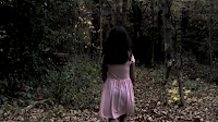
The first shot we decided to use to start our thriller opening was an eye levelled (from the ground) shot. We had not originally planned to use this shot, but decided it would be a good way for the credits to begin; they would appear over the dark corner which is covered in leaves, allowing the audience to watch the girl begin to walk away, as well as seeing the credits beginning


I wanted to use a long shot in the first frame, 
which would change into a mid shot and panning shot to emphasise and convey the girl walking through the forest in different ways to keep the audience interested. These frames can be seen opposite and below.


In the first 3 frames shown opposite and above, we included a tension building deep piano soundtrack, which is parallel to the sounds of the leaves crunching beneath the girls feet. This should build suspense as the opening sequence begins as it suggests that the girl is in sync with the sound, foreshadowing that when the music reaches it climax, so will the girl, through her death. This will make the audience want to continue to watch the rest of the opening thriller sequence.


I used a mid shot of the girl here which would flow into the POV shot to make it clear to the audience that what we are seeing is what the little girl is seeing. The POV shot is used to help viewers connect to the girl by feeling like they are in her shoes, seeing what she sees. They will then be able to sympathise more easily with the girl, as well as feeling more nervous for her.


All of the frames shown opposite and above will all be in a low key light and will have a non-diegetic, tension building soundtrack playing softly in the background. This will help to build suspense through the music and the limited detail shown through the low key lighting which makes it conventional.


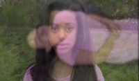
This frame shows the first flashback of the opening which shows the 2 sister happily playing around the tree. The flashback will be made clear to the audience through the use of high key lighting and the Gaussian blur effect used on this frame, shown opposite.  Using flashbacks is conventional because it interrupts the actual narrative, to give the audience more information on the characters past; in my narrative, this may make the audience learn more about the girl and so feel closer to her. To make it clear when the flashback has finished, we used a fade into the frame showing a long shot of the little sister continuing to walk into the forest, where the lighting would also switch back to being low-key.


The transition of the fade is a quick and simple way to make it clear to the audience the difference between normality and the flashback, without it taking away from the effect of the actual thriller.


The next frame shows another mid shot and panning of the girl walking past a tree with the scarf on, to show a variety of shots, which will trigger her next flashback. This can be seen opposite. The idea of the girl walking straight past the scarf without even noticing it, shows how stereo typically dumb victims can be, but to make this idea unique, the following shot shows the girl actually noticing the scarf, suggesting that our narrative is not going to be predictable.

 
The next 2 frames shown opposite and below, show a zooming in shot to a close-up of the scarf, followed by the next flashback portraying the 2 sisters, one with the scarf on. The zooming in shot into the close up of the scarf shows the importance of the scarf within the clip, foreshadowing that the next part of the opening will be about this scarf, and due to the tension building sound playing in the background, gives the ongoing impression that the flashbacks are leading up to something very bad.

When editing, we added an effect over the zooming in shot of the scarf, to make it look blurry and out of focus for a few seconds. This created a nervous atmosphere as the audience don't know why the scarf is like this, or what is to happen next, and so they begin to feel curious as to what the thriller opening will lead on to.


Shortly after this, there is a blackout which leads into the underwater scene. During this blackout, the audience will hear a crescendo of music and sound effects, beginning with the sound of footsteps running through the forest, then into a scream and lastly a the splash sound, which will be followed by the underwater scene. This manipulates the audiences senses as they cannot see what is happening and so have to imagine the events through the sounds they are hearing.

Whilst this crescendo occurs over the blackout, the title credit of the film 'Nostalgia' appears through a glow fly in/out effect. The colour white contrasting to the black background suggest the differences between good and evil; victim and villain, which is a conventional and typical element to include in any thriller film. The hint of red in this credit suggests danger, and so foreshadows how the opening will end. It builds tension and makes the audience sit on edge to find out what will happen, which is very conventional in thrillers.


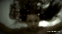
The first frame is a mid shot showing the killers arm around the girls throat strangling her; I only wanted the killers arm in this image so we can keep creating the enigma of who the killer is, which is conventional to the thriller genre.


The next frame in this underwater scene is of a close up of the girls face to show her shock, having been attacked.
The music played during this underwater scene is very fast to help build tension. It helps to increase the pace of the clip, meaning the audience don't have time to process and think about what they are seeing. The music then slows as it fades from the extreme close up of the girls eyes in the flashback, to the extreme close up of the girls eyes in normality. This shows how the images match the sound, making the audience feel in sync with the little girl, experiencing the same shock etc that she is feeling.


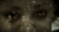
This leads into an extreme close-up shot of the girls eyes, which should emphasise the shock on her face. By ending the underwater scene with the close up on her motionless eyes, it makes the audience believe she is dead. It is here I want the audience to be asking questions such as 'how can she be dead if we are seeing the flashbacks in the first place'; it creates a sense of confusion, which heightens the emotions viewers are feeling.


This shot then fades into an extreme close up of the girls eyes but this time in reality. The reason for having the same image of the girls eyes in both the flashback and in reality is to highlight the shock the girl is feeling from remembering the flashback; she experiences this shock at the same time the audience does and so I hope this will help the audience feel connected with the little girl


The next few frames involve the girl looking at some track marks, supposedly leading out of the river. This then fades into the flashback shown opposite of the little sisters body being dragged out of the water. This shot would be shown very quickly so the audience don't have much time to think and question what they are witnessing, which makes them feel nervous and also builds suspense, making it conventional.


The next frame shows a zooming in shot to the rose which has been placed near where the younger sister was when she died.


We then see the little girl pick the rose up for closer examination, which tells the audience that she too doesn't know why it is there.


The next frame shows an over the shoulder shot of the little girl holding the rose. 

It is this scene involving the rose, where the little girl realises that she is dead. This should be a surprise to the little girl and the audience, which builds suspense as it is so shocking. This therefore incorporates the 3 S's (Surprise, Shock & Suspense) into our narrative which is very conventional in thrillers. 


The close up of the rose, along with the shallow focus used, allows the audience to think of its purpose and meaning within the narrative. The iconography of the white rose is to symbolise the sisters death, whilst conveying her innocence and purity. This should confuse the audience but also make them feel sorry for the little girl


This then fades into the next flashback showing the older sister placing the rose down. This will make the audience feel mixed emotions towards the sister such as how she is loyal or confusion as to her where abouts. This creates an enigma as to what actually happened to the girl and where did the older sister go. It is these many questions that viewers ask that makes our narrative conventional as it proves they are confused, and confusion is a well known theme in thriller films.
t

The frame shown opposite is the last frame in our opening. It shows a zooming our shot of the little girl dead on the floor. The zooming out shot creates some distance between the audience and the scene, allowing them some time to reflect on what they have just seen.


All of the elements that my group and I have used in our thriller opening sequence are conventional in some way as they make the audience feel or think something. This incorporates the 3 S's (Surprise, Shock & Suspense) into our thriller narrative. Whilst our narrative is not the most stereotypical of thriller films, as it doesn't focus on the attack and death of the little girl, the credits make our opening more conventional. Our credits, shown above, are of a child's style, and the 'tracking' effect we put on them in our opening, helps them to build tension. The child's style could suggest that the little girl in our thriller has written them herself, and so has written this narrative too. This creates an enigma of how she can write this story if she is dead, and will confuse the audience, building more suspense.

Our finished thriller opening sequence can be seen below;


Thursday, 28 November 2013

Production Roles - Miss Miller

When creating a film, it is easier to allocate specific roles to the people involved as it will make the process more organised. That way everyone will have their own jobs to do and can contribute their small part to the making of the film. By doing this, it makes it less stressful as if everything was left to one person then they would feel overwhelmed and the film would not be as good.
The main roles necessary for creating a film are;

  • Actors - as otherwise we would have nothing to film.
  • Director - the person who is in charge of the making of the film.  
  • Producer - responsible for the 'financial and managerial aspects of making a film'. 
  • Director of photography - controls the camera and films everything.
  • Sound technicians - to plan the sound used.
  • Screenplay Writer - the person who writes the script for the film.
  • Mise-en-scene Coordinators - to plan and prepare all the lighting, hair & make-up & Iconography etc. 
  • Editors - To edit the footage filmed, to finish the film and to create an effect for the audience. 

When planning our opening credits we had to make up some names so that there wasn't the same names being repeated over and over again, as this would look unprofessional. However, even though these names were shown, all of the roles were divided between the three people in my group; Ayesha, Lillian & Myself.

We decided to allocate each other the roles that suited our strengths as this will be beneficial for the end product. It will make the individual feel more comfortable with the tasks involved, if they enjoy it and are naturally good at it, which should help to make the production of our thriller opening sequence easier.

When planning our groups narrative, we decided that we needed 3 characters; 2 sisters and a killer. When choosing who should play these characters, Ayesha said that she had a little sister and so we decided this would be the easiest and most appropriate as they would actually look like sisters, where as if it was me acting alongside a little girl it would not look as truthful. Also, Ayeshas little sister, Yasmin, is good at drama, meaning she would be able to portray the emotions we needed for this character well, and the chemistry between the pair would be good. The role of the actor is to learn their lines and be prepared to follow the directors instructions to make sure they show the emotions that have been planned. Once the filming is complete they would have acted each frame throughout our storyboard on 2 different days; one for the forest and one for the underwater scene.  In our groups narrative there is no dialogue, as my research showed me this was conventional and so the actors in our footage will simply follow the directors instructions etc.

The role of the director is to make sure the making of the film runs smoothly. This would involve them making sure all roles have been allocated, as well as making sure each role has been completed by each person. It is down to the director to ensure everything is completed by the deadline. When deciding who in our group should be the director, we chose Lillian as she seemed keen to do it. It wasn't fair for Ayesha to do this as she was already acting in our opening and it meant that she could make sure everything was done, whilst me and Ayesha did various other roles. Lilian also said she is good at organising things etc, and so thought that she would be able to organise and delegate specific roles, to specific people, whilst keeping the peace, and this should allow us to complete our thriller opening sequence on time.

We appointed Ayesha as our producer and Mise-en-scene coordinator. As she decided the location of the filming in the forest, and as it was her and her sister acting in the film, it was easier for her to know how much everything would cost etc, rather than me or Lillian guessing. It was also easier for her to plan the costumes as she could decide at home with her sister what looked best on them, which was suitable for our narrative. Her role is to work alongside Lillian to help me in deciding on shots etc that we may question when filming. Ayesha has a clear understanding of what would and wouldn't work for our narrative, and knew of some possible settings where we could potentially film; me and Lilian completely trusted her to make the best decision.

I was the director of photography as it was the most suitable thing to do, due to Lillian directing and Ayesha acting, I could operate the camera. My job was to look at our filming schedule and film that specific shot, by guiding the actors into place and telling them what they needed to do and portray. I will be in charge of the filming in the forest as well as in the underwater scene, and so will have to decide what shots work best and executing them. My group allocated me as the director of photography as I had more experience with using a camera than they did, but also because I helped Lilian film our preliminary task and they thought I would be able to experiment with different shots to help convey the meaning of our narrative.

This leads onto my next role as the main editor. I will be in charge of editing our footage, with the help of my peers as well. This was suitable as although we all have a basic understanding of the final cut pro x editing software we are using, I was the one who edited and put together our preliminary task. My group and I therefore decided that I would be able to familiarise myself with the software faster than they could, allowing us to complete the editing within the deadline. Whilst I may not be the one controlling the mouse for the editing, my group decided I am a good leader to suggest ideas etc, and it may be best for me to watch and direct them with the editing, so it showed the right effect. 


Firstly, Ayesha had 3 roles in the making of our thriller opening; she was an actress, producer and coordinator of mise-en-scene. The role she was acting for was only in the thriller for a shorty amount compared to the other female character and so when she wasn't acting, she assisted me in guiding Yasmin for her shots. Therefore she completed her role as actress well and did more than was asked by helping me. When fulfilling her role as producer, we found we hadn't planned a budget, and most of the Iconography and costume used were items that the group had already owned. This is something I would make sure we had if we were to do this task again. I would therefore say that perhaps she didn't complete this role sufficiently, but this would be different if it was an actual professional film as a budget would be essential before any filming takes place. Her last role as the mise-en-scene coordinator was fulfilled very well. She knew what we were hoping to have in terms of the correct costume etc. For example, we originally wanted both female characters to be wearing everyday clothes to allow the audience to relate to them. Ayesha went a step further and came up with the idea that the little girl should be wearing a pink dress to emphasise her youth, making the audience sympathise with her more easily.

Lilians only role was to be the director as this is a big job that requires helping and guiding all parts of the production. I think she completed this role well and had many creative ideas that she wanted us to try. She helped in all aspects of the production, making sure me and Ayesha were comfortable and knew what we were doing in each task, which definitely helped to make the production easier. However, I would say that she lacked the confidence to decide on a certain idea when filming. Instead she wanted to try all ideas our group had, and then decide later. This is not necessarily a bad aspect, but at certain points did slow down the filming on the day.

My roles included being the director of photography and the main editor, which involved me supervising and suggesting ideas to members in my group. I think I carried out the role of an editor well as I helped Ayesha with the cutting of our footage, as well as putting in the transitions and opening credits well. I enjoyed my role as director of photography, and tried to confidently film several different angles of each shot so we could decide what worked best. The experience from filming in the forest to the underwater scene was interestingly different, but I think I was able to produce steady shots with or without the aid of the tripod, and this helped the filming on the day go quicker. 

Overall I would say we all carried out our individual roles well, and although there were some problems, we worked together as a team to solve them and try to produce our thriller opening as best we could. 

Thursday, 21 November 2013

Planning opening credits - Miss Georgiou

Credits are important in the opening sequence of a film as it helps to set the scene and prepare the audience for what is to happen during the film. They do this through the way the credits are presented in their style and font etc. For example, if the credits were white and jumpy in contrast to the dark background I would assume the film is a thriller, but if the credits were pink and in a swirly font,  I may assume that the film was about a romance etc. It is important to plan the credits so that we make sure they are appropriate and conventional to the thriller genre so that they match the images and music etc on screen. Opening credits also introduce famous directors and actors, as well as the production name and a particular trademark.

                                               
When looking at the opening credits of particular thriller films, I looked at the film Se7en as I thought there was more to talk about and the way the credits are presented are interesting. (See clip below)


When analysing the credits used in the above clip, I looked at;

  • The colours used in the opening sequence (focusing on the colour of the credits). 
  • The Style of the credits
  • The thriller conventions used which make it clear to the audience that they are watching a thriller. 
  • The order in which the roles appear on screen.
When looking at the colour of the credits, I noticed they were white, which contrasting to the black background, could represent the idea of good and evil; the victim and the villain. This is conventional to thrillers as it gives the audience the impression that this film will be about a typical thriller film with a protagonist and antagonist, which results in the victim being killed, etc. However, this could also build suspense as it may make viewers think, 'is a thriller film ever that simple?', 'is it trying to make us think it is straightforward, so that the shock will have a bigger effect on us?'. It is this confusion and self doubt that builds tension and makes the audience feel on edge so they will be even more shocked when they watch the film. All of this is created from a simple contrast in colours, from white to black.

When looking at the style of the credits I noticed they were in a handwritten style, that was presented and edited to be very 'jumpy', like they were flickering or an earthquake effect. The jumpy and jerky images the audience see is done on purpose as this is how the audience should be/ are going to be feeling like when they watch the clip. It creates an enigma as they do not know who the handwritten styles belongs to. This is the same in the thriller opening as they do not know who the killer is, and so the style used could foreshadow what the viewers are about to see.

When watching the clip shown above, I noticed there were many conventions used to make it clear to the audience that this is a thriller film. The first convention I noticed was the use of the blood dripping on the paper, which can be seen at 0:48 to 0:50 in the above clip. This foreshadows that bad things are going to happen in the clip, such as a murder which makes the audience feel nervous and sit on edge. Another convention I noticed was the use of strobe lighting which increases the pace of the opening, which creates a jumpy effect and builds tension. This fits in with the style of the credits as it makes the audience anxious and nervous to know what is to happen next. The last convention I noticed was the music that was used which was eerie to make people jump. It also was parallel to the images shown and so this suggests that the film will be in sync with the events shown and also with the emotions the audience will feel.

The last element I analysed was the order of which the credits were shown. The order of the credits shown in Se7en is;

  • Company Name 
  • Production Name
  • Director
  • Famous Actors 
  • Title of Film
  • Actors continued
  • Casting 
  • Music
  • Costumes Designed by
  • Editors
  • Production Designed by 
  • Director of Photography
  • Co-executive Producers
  • Executive Producers
  • Written by
  • Produced by
  • Director
I noticed that the famous actors involved in the film are shown first as this helps to engage viewers into watching it. The title of the film goes after this to highlight its importance, but I did notice that the title is not shown at the very end as this would represent a trailer clip instead of an opening sequence clip. The other aspect I noticed was that the director has listed his name twice in the film, so the audience don't forget who he is and because he believes he is important and so needs to be shown twice.


Having analysed the opening credits of Se7en, I then chose another opening of a film to analyse, which is from Shutter Island, shown below. 


Again, I looked at the following;


  • The colours used in the opening sequence (focusing on the colour of the credits). 
  • The Style of the credits
  • The thriller conventions used which make it clear to the audience that they are watching a thriller. 
  • The order in which the roles appear on screen.


  • When looking at the colours used I noticed that some were red against a dark background and some were white against a dark background. The red shown first could foreshadow that the beginning of the film will involve a murder or some kind of danger, as this is what the colour red denotes, which is conventional to thriller films. The red used at the end for the title could also suggest that the whole film is about danger and blood etc, which focuses the audiences attention on what the film will show next. The white colour against the dark background, like the opening of Se7en could represent the ideas of good and evil; the victim and the villain. This is conventional to thrillers as it gives the audience the impression that the film will consist of a protagonist and an antagonist which ends with the victim, and perhaps many other people being killed.


    When looking at the style of the credits I noticed that it varied depending on the title of the credit. The order of credits shown in the opening of Shutter Island was;
    • Director - 
    • Producer - 
    • Screenplay Writer - 
    • Based on the novel by - 
    • Director of Photography - 
    • Famous Actors- 
    • Editor - 
    • Music by - 
    • Title - 
    For the Director up until the Screenplay writer the colour of the credits were red, which changed to white for the rest of the opening, except the title at the end. The style of the credits were quick and blurry, almost like the disturbance old tvs used to receive. This is conventional as it increases the pace of the clip and builds suspense.  As well as this there was capital letters used for everything, unlike in Se7en where capital were only used for the different roles. This could be conventional as it creates confusion and makes it harder for the audience to read, suggesting that this confusion could run through the film. 
    This blurred and jumpy effect was used for the director credit until the famous actors, where they were shown in white and in clear focus. This is to emphasise the importance of the actors as these are what the audience will recognise and what will make them want to watch the film. These credits were only blurred and jumpy when appearing and disappearing, so that they fitted with the other credits and stayed conventional. The last 2 credits went back to the blurred and jumpy effect, which then changed into the bold red title of the film which was in full focus. The title was zoomed in on to show its importance, and then the camera zoomed through the 'R' of 'SHUTTER ISLAND', to give the film a way to start. 


    When watching the opening to Shutter Island, I noticed there were many conventions used to make it clear to the audience that this is also a thriller film. The first convention I noticed was the use of the colour red which denotes danger etc. The use of this at the beginning and the end of the clip helped to build tension. The second convention I noticed was the use of the blizzard snow throughout the clip. This helped make the opening a bit chaotic which gave the impression that the film was also going to be chaotic. Other conventions I noticed was the use of low-key lighting, the fire at 0:26 to 0:30, the lighting of the match at 0:49, both of which imply danger and suggest the use of fire in the film. There was also the prison cell shown at 0:40 to 0:45, and the iconography of the gun at 0:30 to 0:35, which suggests this will be one of the murder weapons in the film. Lastly, the music was conventional as it built suspense as each credit came up.   


    Having researched into how opening credits are presented and why they are presented in that way, we discussed in my group the credits we wanted to include for our opening thriller, which are;

    • Company Name - Dark Productions
    • Director - Lillian Amaning
    • Actors - Ayesha Bhatti & Yasmin Bhatti
    • Title - Nostalgia
    • Casting By - (L) Katie Mitchell
    • Music By - (A) Olivia Edwards 
    • Costumes by (D) Daniel Woods
    • Hair & Make up by (A) Laura Smith
    • Editor - Deanna Mathers 
    • Production - Ayesha Bhatti
    • Director of Photography - Lillian Amaning 
    • Director of Photography (underwater) - Deanna Mathers

    We then had a go at creating some examples of what we would want the credits to look like. We used the editing software 'Final Cut Pro X' to do this.


    The first example was Lillian's idea, which can be seen opposite. She wanted to show the contrast between the black background and the red writing on the white paper. The use of the colour red is conventional as it could represent blood, which foreshadows that something bad is going to happen, such as a death. She showed this on a piece of lined paper to present the idea of the narrative being realistic, as everyone can access paper, and so our narrative could happen to anyone. This would make the audience feel nervous for their own well-being when watching our thriller opening. The contrast of colours could show the difference between good and evil; victim and villain, which is a typical element to include in most thriller films. Lastly, she used a bold, sharp font to emphasise the title 'Nostalgia' to make the audience think about its meaning; Nostalgia - Longing for the past - which gives them an idea as to what the film is going to be about. 

    The next example is my idea, which can be seen opposite. I wanted to show the contrast between the colours white and black, which could represent good and evil; victim and villain. This is a typical element to include in a thriller film, and I wanted to show how closely connected they both can be. I used the credit including the ink smudges to make our narrative realistic, as ink is an accessible item, suggesting like Lillian, that the events occurring in our narrative can in fact happen to anyone. This could also be a negative metaphor saying that the film will not run smoothly, and so foreshadows that it will not involve a simple narrative. It could also suggest that what happens in our thriller opening, such as the death of the little girl, was accidental, just like ink spillages are accidental. 

    We showed each other our individual ideas and decided to use the best parts of both of them to come up with our best credit, which can be shown opposite. I liked Lillian's idea of making the audience think about the meaning of our title 'Nostalgia' and so the use of the red colour for the credit with a black outline is to do just this. We both wanted the colours to represent the differences between good and evil; victim and villain and so the use of the colours red, black and white help to do this. Lastly, Lillian like my idea of using the ink, and so we both decided to keep this idea, but change the colour to a dark red to make it seem like it was blood. This is conventional to thrillers, and will make the audience guess their will be a murder/death of some sort, which creates the sense of danger, which also helps to build suspense.

    Wednesday, 20 November 2013

    Filming Schedule - Miss Georgiou

    Filming schedules are used to keep everything organised and clear for those involved in filming. A filming schedule usually involves;

    • Type of shot - Number 1, 2, 3 etc
    • Date & Time - Used so everyone knows when this shot is being filmed. 
    • Content/Action - Used to briefly describe what happens in this shot, to remind the director of photography and all those involved in filming what needs to be filmed.
    • Shot type & Duration - whether this is a high angle or tracking shot etc. It is used so everyone knows what shot the schedule is talking about. The duration is to remind everyone how long this shot should take to film. 
    • Costume, Hair & Make-up - To remind everyone what the actors should look like, to make sure they get everything appropriate and correct. 
    • Iconography - To remind those involved what iconography is used in that particular shot. 
    • Personal - Who needs to be present at filming, e.g - actress, director etc. 
    • Equipment - To remind everyone involved what they need for this shot, so they don't forget to bring it. 

    We created our own filming schedule to ensure that we were organised. This helped me and my group to gather all of our ideas onto a single page, which we could follow when filming. We hope that as it is detailed, it will help us to be organised on the day of filming, reminding us what we need to bring and what each shot should involve etc. It should help the filming of our thriller opening easier, as it will help things run smoothly and quickly.

    Having completed the filming, we had to change some of our plans from our filming schedule. For example, when looking at the schedule we noticed we had planned to film the dragging of the body out of the water, which would be a flashback, into the normality scenes involving the rose. This didn't work as it would mean getting the girls hair wet for the first bit, and then it would need to be dry when filming the rose scenes. To solve this, we simply left the dragging of the body scene until the very end of the day. Other than this, we followed the filming schedule well, and filmed a few of the shots a couple of times from different angles, so we could choose the best ones during the editing stage. 

    Risk Assessment - Miss Georgiou

    Risk assessments are carried out before any filming has taken place and are important as they ensure the location etc, is safe for all the actors and crew involved. A risk assessment involves you identifying the risks, analysing the potential dangers of them and evaluating how you are going to minimise this risk.

    During the planning stage of our thriller opening clip, we carried out a risk assessment to ensure all involved were kept safe during the filming. My risk assessment can be seen below;


    As you can see, I have analysed both locations for the filming of my thriller films; In the forest and using the swimming pool. Creating this risk assessment made me realise how important it is to plan your locations to prevent accidents from happening. For example, having made this risk assessment I have spoken to an appropriate adult who can supervise us whilst using the school pool to make sure we are all kept safe, Without completing this risk assessment, I wouldn't have done this.

    Having completed the filming, I found there were a few more risks that we had encountered. Firstly, when trying to film the dragging the little sisters body out of the river, we found we could not get close enough to the river due to it being too dangerous. We resolved this problem by finding a nearby ditch, and simply showing the girl being dragged on grass. We only filmed from the waist up to hide the fact that she was being pulled from a ditch and not the river. The other issue we had was carrying a knife with us for the filming. We had planned to use this knife as a murder weapon as this is conventional to thriller films, but didn't realise until the day of the filming that this would not be a practical idea. Instead, we had to slightly change our narrative and filming schedule, to film the scenes without the knife. Other than this, we followed our risk assessment and finished the filming safely. 

    Planning Editing Styles - Miss Georgiou

    Editing in any film is used to create a certain effect and make the audience feel something. In thrillers, if used correctly, editing can be used to tell the audience who the villain/victim is. It can also help the scene to flow and/or build suspense. Planning editing is therefore essential as otherwise, you won't know if the sound and cinematography match, and so cannot film. Editing styles can make a thriller more conventional, and so my group and I decided the styles we wanted to use were;
    • Jump cut 
    • Fade
    • Continuity Editing 
    • Montage
    Jump Cut - 
    A jump cut is when the film suddenly focuses on something. In my opening sequence, we wanted to use jump cuts at the beginning of the clip when the little sister is walking through the forest. This would allow us to vary our editing styles, making the thriller more interesting for viewers. It would also mean the audience could re-focus on the girl after every edit, which should allow them to find things to relate to her by. This will help them to build a relationship with this character from the second the film starts, which will be beneficial later on in the opening as they will be able to sympathise easily with her character. Jump cuts are conventional as they speed up the clip, giving the idea of 'jumping' forward each time,which creates the idea of danger in the clip. It means the audience are not given time to process what they are seeing, which builds tension, making the audience nervous as to what is to come next.  

    Fade - 
    A fade is a simple, but effective editing style to use, which involves the image fading into the next image or into black, which would suggest an ending to a scene. In my thriller opening, we wanted to use fades frequently as a clear way to show the transitions between normality and the flashbacks, as otherwise the audience wouldn't understand our narrative. This fade would also fit with the title of our thriller opening 'Nostalgia', which means 'longing for the past', and so this would foreshadow that something has happened to make the girl want to remember her past. This makes the audience nervous due to the enigma created of what actually happened, and the suspense made throughout, which makes the narrative conventional.

    Continuity Of Editing - 
    We wanted to use this style of editing throughout our thriller opening as it would allow the events to flow. It would give the impression that the edits are motivated by the events in the reality on screen. We decided we didn't want to overwhelm the audience with using a different editing style each time, and thought that for some parts of the opening, the narrative, mise-en-scene, cinematography and the sound used was powerful and effective enough, without the need of an edit. We thought our narrative wasn't stereotypical to thrillers, as it didn't focus on the attack and death of the victim. We therefore didn't want to change this by using stereotypical editing styles.


    Montage - 
    A montage is the speed of the editing, where the shots are quickly juxtaposed together to create excitement. We wanted to use this throughout the underwater scene to increase the pace of the footage, to build tension. The idea was that the montage replicated how the girl was feeling at that point. She would be confused and shocked, and everything would have happened very quickly; we wanted this to be reflected onto the audience so that they would understand the little girls emotions better, and thus feel closer connected to her. It would also allow us to vary the editing style again, making the underwater scene stand out and engage the audience. The build of suspense that will be created through the excitement of the clips put together is conventional as it makes the audience sit on edge and eager to know what will happen next.


    I think the different styles of editing we have planned to use will make our thriller opening more interesting, which will help to keep the viewers engaged and interested. The use of the montage and the jump cut, will help to fasten the pace of the clip, which would automatically build tension as the audience don't have time to think about what they have just seen. This makes it conventional as the audience will feel overwhelmed and nervous as to what will happen next etc.

    Planning the editing styles has helped me as it has given me and group a very clear idea of how we want to present things, and the response we are trying to get from the audience. The planning of this has been beneficial as it matches the images and sounds we have already planned, meaning the making of our thriller opening should run smoothly. By planning in this much detail, it has meant that I can now clearly visualise how I want our thriller opening to be, and should just be a case of trial and error to see if the effects are as good as we imagined them to be. 

    Thriller film inspirations - Miss Miller

    Before creating a clip, it is a good idea to think about everything that has inspired you from things you have previously watched. It helps you to gather your ideas, and possibly expand on some ideas of your own to make sure they create the best effect. We can take our inspirations from anything, such as books, TV programmes, films, pictures, narratives in general (such as those used in music videos) etc. An inspiration is anything which you thought was good and gave you some ideas; it can be anything.

    I have taken my inspirations mainly from other thriller films as this is related back to the task of creating our own thriller opening.

    When looking into mise-en-scene, I analysed a clip from the film Asylum, called “Leave me alone” I have learnt that thrillers don’t always need any iconography or many different settings, and sometimes by keeping everything simple, you can create the best effects. This will help me in creating my own thriller clip as it inspired me to plan to keep the majority of the conventions simple, such as only using one location, so that my viewers don’t feel overwhelmed unintentionally by all that will be used in the scene.
    I plan to use this idea in my thriller opening by only having 2 settings, which are a forest and a river, and 2 pieces of Iconography which are a rose and a scarf. The forest is conventional to thrillers as it is isolated from everything, meaning the victim will be unable to get help. The river can be found in most forests, and suits our narrative. Not a lot of thriller films use underwater clips as this can be tricky to film and so by including it, will make our thriller film unique.
    In most thriller films I have seen, the victim is always stereo typically a female dumb blonde girl. I didn't want to follow this stereotype and thought instead I could use other elements of mise-en-scene to clearly portray the victim. The iconography of the scarf will emphasise the youth of the girl, due to its pretty pink design. This is the same for the everyday appearance of the girl, in a pink dress, looking natural. This is a clear way of presenting the victim to the audience, instead of copying what every other thriller narrative does, but still keeps it conventional.


    When looking into Cinematography, I looked at the clip called “trying to kill me” from the film Red Eye. I have discovered that a specific camera angle/shot can be used in a variety of ways to portray a certain character.For example, a high angle shot would normally be used to portray the victimised characters, but in the clip I analysed, the high angled shot was used to show the week side of the villainous character.
    This will help me when making my own thriller opening sequence as it will remind me that I don’t have to use cinematography in the stereotypical way certain shots are used in the thrillers. Some of them can be used in another way but can create suspense and provoke a response from the audience, and this may also make my thriller more original. As well as this, it inspired me and gave me an idea to use in my thriller opening. The idea is to use a particular shot such as a high angle to always portray a specific character (the victim), so that the audience will associate the same feelings towards this character every time this angle is shown in this way. 

    When looking into editing,  I analysed the different editing styles used in the clip called “Here`s Johnny” from the film The Shinning. I have concluded that the most common styles used in the thriller genre are jump cuts and slow editing. For example, slow editing is a quick way of building tension, which allows you to manipulate your viewers as they can experience a variety of emotions. Jump cuts are used to make the audience suddenly focus on something. The use of them inspired me as it gave me the idea of using jump cuts to focus on the little girl walking through the forest, but will also speed up the amount of time it takes to show this. This should help to keep the audience engaged and interested. This, along with my understanding of other editing techniques, will help me when making my own thriller clip as it has made me realise that editing is used to make the film run smoothly, which is something I am aiming to do.

    When deciding on my individual narrative, I thought about all the inspirations that I found from the films I have watched. For example the film prom night inspired me due to the hidden identity of the killer and the film 'the strangers' inspired me because of the low-key lighting and cinematography used to portray the victim. These films inspired me and gave me ideas as to what I could include in my opening thriller clip.  
            
    My idea is about a child having a nightmare where she dreams about being in a park on a swing, happily playing, before the killer takes her. I would set this in a detached house surrounded by forest as this is stereotypical of any thriller films. I would use cinematography such as high and low angled shots to portray the child as the victim. (Inspired by The Strangers) and the music and sound effects to build suspense. I would keep the killers identity hidden (inspired by Prom Night) and would try and create an enigma to leave the audience guessing
    For example, I would use one main piece of Iconography such as a teddy bear/ scarf that belong to the child, which was with her when playing on the swing. When the child wakes from the nightmare, all would seem well again, but to create an enigma, I would use a zooming in shot through the bedroom window to the park where her teddy bear/scarf would still be. Completing this post has helped me think about everything that inspires me in thrillers films which allowed me to create my individual narrative. This helped me when planning my groups narrative for our opening thriller clip as it gave me a place to start, where I could elaborate on my points and ideas and create a better narrative involving every ones ideas. 

    When deciding on what age certificate we should give our thriller opening, we looked into the BBFC and compared the contents of our clip to those in well-known films. 
     The BBFC stands for the “British Board of Film Classification, and is important to the film industry as it is in charge of classifying all films. Its job is to protect the public from content that is unsuitable for their age group, and to stop children seeing explicit images that may harm them. It also allows parents to make informed viewing choices by acting as a guide. The BBFC classifies films, video/DVD`s trailers, adverts and some video games.
    This post allowed me to research and gain an understanding of the film certificates to help me in choosing my target audience for my narrative.
    The certificates include;

    U (universal) – “Despicable Me”
    PG (parental Guidance) – “Scooby-Doo the Movie”
    12 – Sherlock Holmes
    12A – (children under 12 can see this film at cinema, with an adult only)
    15 – The Hangover
    18 -Se7en

    Having researched into all of the above age certificates, I  decided my target audience would be a 15 rating as strong violence is allowed as long as the film doesn't focus on the infliction of pain/injury. This would suit my groups narrative as the underwater fight scene resulting in the girls' death seems violent, but there is no focus on how she died etc and so is suitable for a 15 rating.

    To help me decide on what worked in a thriller film and what didn't, I looked into the history of thriller films and focused on how they have changed over the years.
    Thrillers films are those which have an element of pure suspense, excitement and tension. When researching different  thriller films, I noticed that they have changed and developed a lot over the years. Looking back on earlier films they seem somewhat unrealistic compared with what we see know, but this is due to the development in technology.
    Having researched into thrillers films varying from the 1940`s to  the present day, I have discovered what has worked well over the years and what has not. For example, the most successful narrative used since the 1940's is obsession. This will help me when deciding on a narrative for my thriller opening sequence, as I will base my narrative on a similar theme. This  should help to create suspense in my opening as it has already been proved to have been successful.
    This research inspired me to use a similar theme of obsession in our group narrative. The idea in my groups narrative, of the several flashbacks and the enigma created from not knowing who the killer is or why he killed the girl, makes it seem like he was obsessed with killing this girl, and also suggests that the girl was obsessed with finding out how she died.

    When looking into the conventions of the thriller genre, I analysed a clip from the film "House of the end of the street" called "the basement scene". This post allowed me to use all of my knowledge of the conventions of a thriller film in the single post to show my understanding. I talked about the different types of sound used, cinematography, editing and aspects of mise-en-scene such as low-key lighting and  costumes, hair & make up.
    This post helped me gain some ideas as to how I can use these conventions when making my own thriller clip. For example, I could use a high angled shot to quickly show my audience who the victims are, without wasting too much time. I learnt that sound is what makes any clip have an effect on the audience, as without it, the images are not scary. This post  helped me realise that I can use as many or as few of the conventions of the thriller genre in my own thriller clip. It inspired me to be courageous with the decisions we make, so that as long as we can justify why we used them and what effect they create, then anything can be used. 

    When looking into sound, I looked  into how it is used to build tension and suspense in order to engage the audience in the scene and make them feel something. Having researched into sound, specifically  looking at the clip from " the panic room" I have discovered that sound can be used to help create an understanding of the scene for the audience. It helps add meaning to an image which without sound would not have the same effect. This will help me in creating my own thriller clip as it will make me think about why I have used a particular sound and the effect that it has. I could also use a sound appropriately to ensure my viewers understand how a particular character is feeling. For example using a slow tempo soundtrack to show the character feeling sad. What inspired me from the film 'the panic room' was how effective the sound was, but also how the images matched the sounds used. This helped me as I want to make sure that the images and sounds match so the best effect can be created. 

    When looking into opening sequences, I looked at other films openings to gain some ideas. The opening sequence I analysed from the original film "Halloween" filmed in 1975, was good as it used most of the aspects I thought should be in a thriller opening sequence.
    Having gone into detail about the narrative, cinematography, editing. sound, the representation of characters and the overall conventions used in the clip, I concluded that you can use as many conventions in a thriller opening sequences as you wish to, and you shouldn't  limit yourself to only using stereotypical  conventions such as the  low- key lighting. This opening sequence  inspired me and gave me some more idea for my own thriller clip. Thinking about my own narrative, the setting of the detached house surrounded by forest is the same for my narrative, and so I will be definitely be keeping this if I am to use my individual narrative as my final clip. The clips use of hidden identity all the way through out inspired me as even after the possible identity has been revealed, the  audience  are still  not convinced. This gave me an idea that perhaps I don't have to tell the audience who the killer is at all, and instead I can leave my opening clip with a big enigma which will leave the audience guessing. I can do this by showing, or inferring that the little girl died, but not giving anything more away as to who could of done it, or what their motives were.


    Researching all of the elements listed above was helpful as it gave my group and I time to gather our thoughts and decide which ones worked best etc. We can then use these newly thought ideas to create a new storyboard, ensuring this one creates the most effect on the audience. Looking at my inspirations gave me many ideas as to how to make my thriller more conventional, but also how you can adapt certain elements such as the portrayal of victims, in your own way, to make the thriller unique.  

    Monday, 18 November 2013

    Planning Sounds - Miss Miller

    The use of sound in any film is important as it helps to tell the story by defining an image more clearly and also helps to provoke a response from the audience. In thriller films, sound is used to build tension and suspense in order to engage the audience in the scene and make them feel something. We needed to plan the sound we wanted to use to enable us to complete our thriller opening within the deadline. Sound is what makes a thriller film scary or 'jumpy' and so will play an important part in the making of our thriller opening.We needed to make sure that we matched the sounds used with the images on screen, and as we had already planned the cinematography my group wanted to use, it was a little bit easier to plan the sound.


    Parallel Sound/ On-screen sound
    Parallel sound is when the sound and the images on a screen complement eachother. We have decided to use parallel sound at the beginning of our thriller opening; when the little sister is walking, we will hear the sound of leaves crunching beneath her feet. This sound will match with the non-diegetic music that will be playing. We decided to use this as it allows the scene to start straight away, as the audience focus on the girl walking, and nothing else. This is conventional to thrillers as everything the audience hears, will make them feel nervous and think something bad is going to happen, which is typical in thriller films. It will help viewers connect to the little girl and will also draw the audiences attention on the girl and since she is portrayed as being innocent, they may feel nervous for her as they are scared something will happen to her, which is enforced from the parallel sound that they hear.


    Silence
    Silence is frequently used in thrillers as it helps to build tension which is very conventional. I thought it would be good to incorporate silence into our thriller clip because of this reason. We therefore decided to have periods of silence straight after the underwater fight scene which is where we see the extreme close-up of the girls eyes from the flashback into reality. This would be effective, as it would contrast from the loud tension building sounds played in the fight scene, into the immediate silence that would show the girls shock having remembered this flashback. I hope by having this period silence here in our opening, it will overwhelm the audience as they begin to reflect on what has just happened, which should make them feel nervous and create a tense atmosphere for the rest of the clip. Not only is this atmosphere created conventional, but it will also allow viewers to connect with the girl as they begin to worry about her well-being.


    Non-diegetic Sound
    Non diegetic sound is any music or sound that is added on after, such as in the editing stage. Before the water scene, we needed to explain to our viewers how the little girl got in the water. We therefore chose to use a blackout, which would be accompanied by a crescendo of sound effects. Firstly, you would hear the sound of running footsteps, with the sound of heavy breathing playing over the top. This would end with the sound of a girl screaming, ending with the splash of water, ready for the underwater scene.  By adding in the sound in this way, it would manipulate the audiences senses as they can only imagine what is happening through the sounds, as they cannot see anything. This will make them feel nervous. By layering the sounds in a crescendo format, it will add a bigger layer of suspense each time a new sound is added, which will create a very strong tense atmosphere for the underwater scene, consequently heightening the audiences emotions. This is conventional as it will mean the audience experience the full effect of the thriller, and will be more shocked at how it ends. The reason for adding the crescendo before the fight scene, was to create an enigma as to what is going to happen to the little girl. The audience connect to the little girl more deeply here, allowing them to sympathise and worry for her.

    Having planned the sound we are going to use and getting inspirations from Freesound.org  , I have found the planning helpful in preparation for the filming. We now have a good idea as to how the cinematography and sound will match, meaning once the footage is filmed, we can solely focus on editing. This should mean that the emotions and the atmosphere created will make our thriller even more conventional and will build tension as it will be in sync.The sounds we want to use are conventional, as when matched with the images, will create tension, and once everything is finished, with the editing etc, the sound will be the main thing that builds suspense and makes the audience feel something.